
Quality is always the key to determining the standard of a product. And to maintain such standards there are universal tools that are being used throughout the industries. These are known as the Seven basic tools of quality. These are a fixed set of graphical techniques that are used to identify all the issues related to quality and assist in solving those issues. The following are all the seven tools of quality control with examples. These 7 tools can be implemented in garment manufacturing to improve the process and product quality.
1. Flow chart
It is one of the basic process evaluation tools that is used to analyse the workflow or the process. It is represented through a diagram that pictures all the steps in the process along with the conditions related to any step. These steps can then be followed to go through the task for successful completion of the objective.The flow chart maps out the steps as boxes of different types according to their processing order and these are connected with arrows. These arrows are in the direction of completing the process but depending on conditions can take on a different course. This diagrammatic representation thus illustrates a solution to any given model and are also used in analysing, planning, documenting or managing a process/program in various fields.

Figure- Example of a Flow Chart
2. Histogram
It is a representation of the frequency (count) distribution of data among different groups of a sample or population. It consists of vertical bars of different heights and each bar represents a different group of the data. The height of the bar is determined by the frequency (count) of the group. The key characteristic of the histogram is that it represents categorization of continuous data with each group being of similar characteristics. It looks similar to that of a bar chart but unlike that, there are no gaps in-between bars and area of each bar is proportional to the frequency that it representsIt helps in summarizing the data that has been collected and represents graphical data frequency distribution in bar form to highlight areas of needed attention.

Figure- Histogram
3. Checklist
The checklist is used to collect quantitative or qualitative data in a form (document) in real-time at the location where the data is generated. When the data is in a quantitative form the check sheet is also called a tally sheet. Its simple data recording and representation can be used as a preliminary data collection tool for creating bar graphs, histograms and other quality tools. It can also be used to control quality by quantifying defect by type, location, cause (machine, worker), keeping track of completed steps etc. You can make garment checking reports using a checklist template.The data recorded in the check sheet is recorded with marking marks “check” on it. These checks are ticked in the sheet at different locations in a matrix and each has its different significance. These checks are read by observing the location and number of marks on the matrix. For better understanding the background information of the data it also consists of the five w’s which are
- Who filled out the check sheet
- What was collected (what each check represents, an identifying batch or lot number)
- Where the collection took place (facility, room, apparatus)
- When the collection took place (hour, shift, day of the week)
- Why the data were collected.
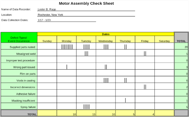
Figure- A Check List
4. Cause and effect diagram (Fishbone or Ishikawa diagram)
Cause and effect diagram was created by Kaoru Ishikawa for the identification of potential cause (factors) leading to an effect (problem). It is mostly used to map out the potential factors for the quality defect which is leading to an overall effect. Each cause or reason for imperfection is a source of variation. Causes are usually grouped into major categories to identify and classify these sources of variation.The first part of the tool requires identification of the problem and the factors leading to that problem. Also, sub-factors are determined if need be by making the factors as a group of subfactors. Then the diagram is drawn with the problem in the centre and the factors affecting it as its root branching out. This creates a highly effective visualization to see all the causes simultaneously and work on them in accordance with their importance.
There are many chronic problems found in garment manufacturing. You can reduce the occurrence of such chronic quality issues by finding the root causes of the problem. And the root cause can be found through the fishbone diagram.
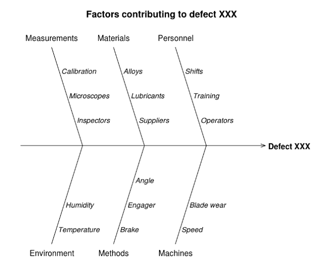
Figure - Cause and Effect Diagram
It is used to highlight the most important among a large set of factors. In quality control, it can be used to represent the most common source of defects, the highest occurrences of type of defects, frequent reasons for customer complaints etc. These charts can be generated by any spreadsheet programs, specialized statistical tool, online charts generator etc.

Figure - Pareto Chart
This is used in different scenarios such as to determine whether the two variables are related, or when there is paired numerical data or when the dependent value has multiple values for each value of the independent variable.

Figure - Scatter Chart

Figure - Control Chart
Additional Reading quality control topics:
Figure - Cause and Effect Diagram
5. Pareto Chart
It a type of chart that consists of both bars as well as a line graph. The bars represent the individual value in descending order while the cumulative total is represented with the line graph. The left vertical axis represents the frequency of occurrence, costs, or other important units of measurement. The right vertical axis represents the cumulative percentage of the total number of occurrences, total cost, or the total of the particular unit of measure.It is used to highlight the most important among a large set of factors. In quality control, it can be used to represent the most common source of defects, the highest occurrences of type of defects, frequent reasons for customer complaints etc. These charts can be generated by any spreadsheet programs, specialized statistical tool, online charts generator etc.
Figure - Pareto Chart
6. Scatter diagram
A scatter diagram (or scatter plot, scatter graph, scatter chart, scattergram) is a type of plot or mathematical diagram using Cartesian coordinates to display pairs of numerical data with one variable on each axis and look for a relation between them. If the variables are correlated, the points will fall along a line or curve. The better the correlation, the tighter the points will hug the line.This is used in different scenarios such as to determine whether the two variables are related, or when there is paired numerical data or when the dependent value has multiple values for each value of the independent variable.
Figure - Scatter Chart
7. Control Chart
Control charts are a statistical process control tool used to determine whether the manufacturing, quality or other aspects are in a state of control. There is always a presence of variations in a process which cannot be nullified as no process can run in an ideal condition for multiple time. This chart helps in control and identification of such variables. This always has a centre line for the average, an upper line for the upper limit and a line for the lower control limit. The control limits are set for a +-3 standard deviation from the centre line. The points recorded in the Cartesian have to be in between these control lines and any variation crossing the lines are an indication of an anomaly that needs to be checked or corrected.Figure - Control Chart
Additional Reading quality control topics: